Alliance Banquet Hall
Client
Alliance Banquet Hall
Services
Dark themed website with booking functionality
Timeline
2 Weeks
Year
2025
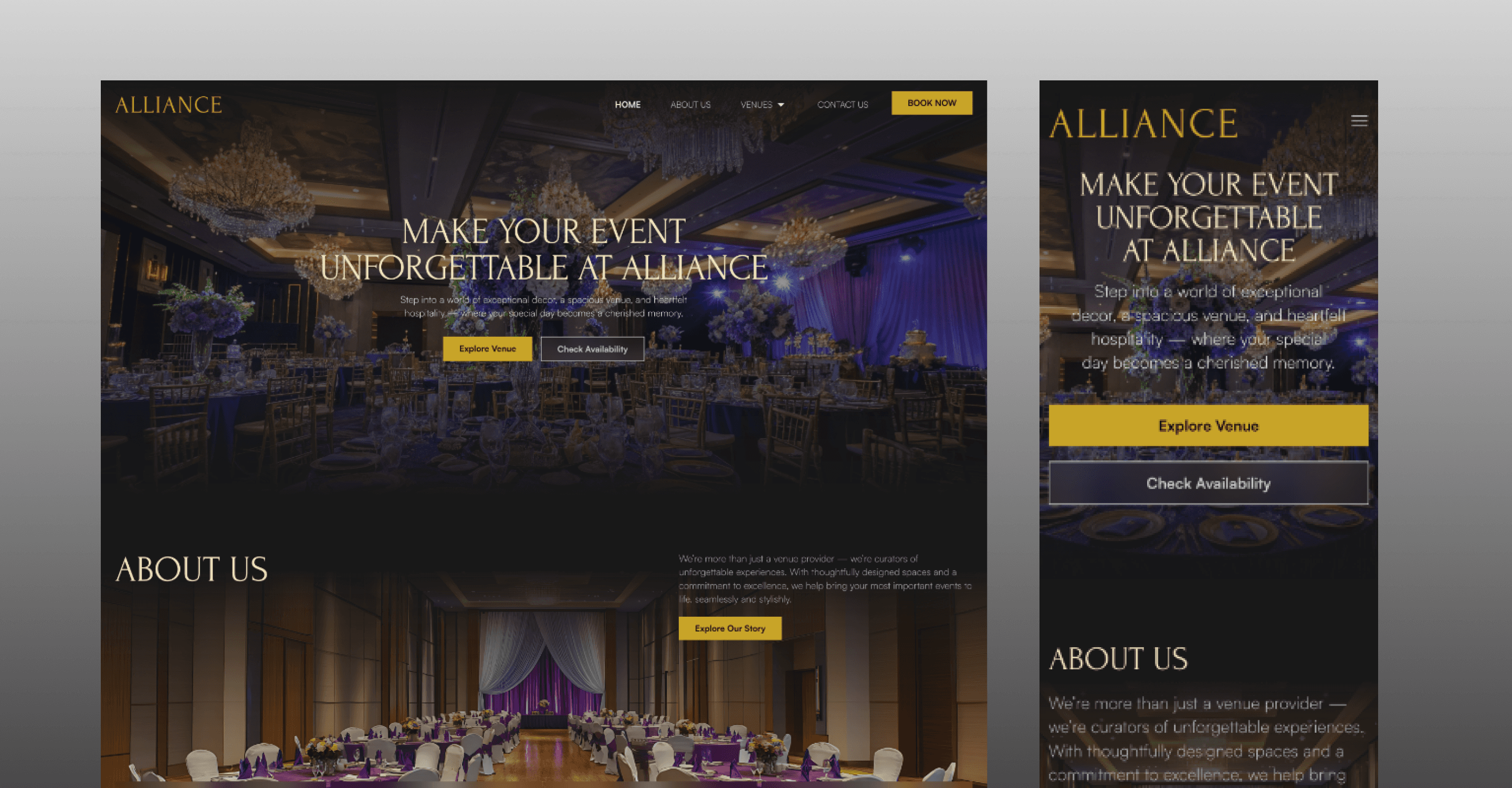
Alliance Banquet Hall — Official Website
Client: Alliance Banquet Hall
Industry: Event Management
Project Type: Dark-themed Website with Booking Functionality
Role: UI/UX Designer (Design in Framer)
Collaboration: Developed by engineering team using React & Next.js
Overview
Alliance Banquet Hall required a modern, professional website that could represent their venue while also supporting online reservations for both their banquet hall and conference room. The website needed to feel premium and visually rich, yet remain easy to navigate—especially for users looking to check availability or make a booking.
My role focused on designing the entire experience, from visual direction to booking flow, while working closely with developers who implemented the final build.
1. Discover — Understanding the Problem
The challenge
The client needed a website that could:
Present the venue in a premium, elegant manner
Work seamlessly across devices
Support booking for multiple spaces without confusion
A key challenge was ensuring that:
The dark theme felt sophisticated, not heavy
The booking experience was simple and reassuring
Users could quickly understand the difference between banquet and conference offerings
Primary considerations
Clear user flow from landing to booking
Strong visual storytelling for the venue
Straightforward reservation experience
UX that reduces hesitation during form submission
2. Ideate — Exploring Concepts
Visual exploration
I explored inspiration from event management, hospitality, and luxury venue websites to understand how dark themes are used to create atmosphere while maintaining clarity.
Concept direction
Elegant, dark UI with strong contrast
Focus on imagery to highlight the venue
Minimal distractions around booking paths
Booking flow ideation
Alongside visual exploration, I brainstormed with my colleagues on:
How users might approach booking a venue
What information do they expect before submitting a request
How to keep the form experience clear and unintimidating
This phase helped define both the visual tone and the interaction strategy.
3. Design — Bringing the Concept to Life
Design execution
Using Framer, I designed:
Page layouts that highlight the venue experience
Clear sections for the banquet hall and conference room
A consistent dark theme with strong hierarchy and readability
Booking experience
Special attention was given to:
Form layout and field grouping
Logical flow of information
Clear call-to-action placement
The goal was to make booking feel simple, guided, and stress-free, even within a dark-themed interface.
4. Test & Refine — Usability & Iteration
Refinement focus
Instead of formal usability testing, refinement involved:
Reviewing booking flow clarity
Ensuring forms were easy to scan and understand
Reducing unnecessary friction during the reservation process
Iterations included
Adjusting spacing and layout for better form readability
Refining content hierarchy to guide user attention
Improving visual balance between imagery and functional sections
These iterations helped ensure the experience felt smooth and intentional, especially for first-time visitors.
5. Delivery — Handoff & Implementation
Collaboration & handoff
Once the designs were finalized:
I collaborated closely with developers
Shared design intent, layouts, and interaction logic
Supported implementation in React and Next.js
Final output
A responsive, dark-themed website
Clear venue presentation and navigation
Integrated booking experience for both spaces
The final website successfully balances visual richness with functional clarity, supporting both brand presence and practical user needs.
Key Takeaways
Dark themes require careful hierarchy and contrast
Booking experiences should feel reassuring, not complex
Early collaboration improves form UX outcomes
Clear structure matters as much as visual appeal