Crony Watches
Client
Crony Watches
Services
Website Design, Landing Page
Timeline
1.5 Weeks
Year
2025
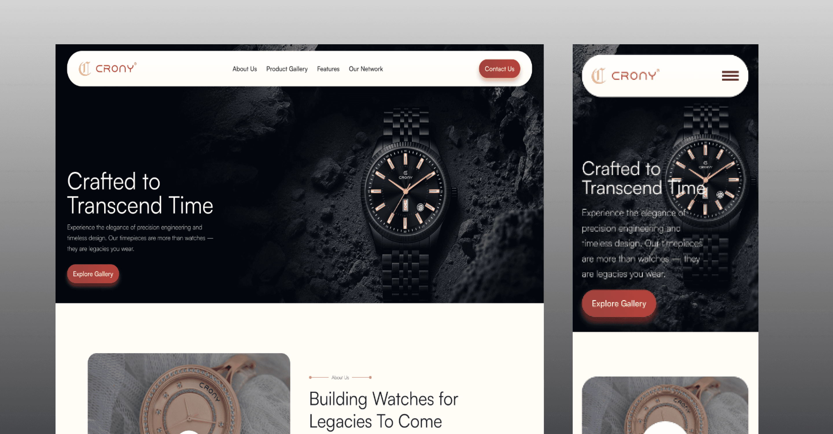
Crony Watches — Landing Page
Client: Crony Watches
Industry: Fashion Accessories
Project Type: Light-themed, Visually Rich Landing Page
Role: UI/UX Designer & Framer Developer
Location: Rajkot, Gujarat, India
Overview
Crony Watches is a Rajkot-based brand offering budget-friendly luxury watches. The objective was to create a landing page that feels premium and engaging, while remaining simple, approachable, and conversion-focused. The page needed to elevate the brand’s digital presence and compete visually with larger, national-level watch brands.
I handled the project end-to-end, from visual direction and UX decisions to final build and deployment using Framer.
1. Discover — Understanding the Problem
The challenge
The client needed a landing page that:
Felt premium without being complex
Clearly highlighted the product offering
Guided users smoothly toward key actions
Key considerations
Strong first impression
Clear content hierarchy
Simple navigation with minimal friction
Visual appeal that supports trust and interest
2. Ideate — Exploring Concepts
Research & inspiration
I explored inspiration from the accessories and watch industry, particularly well-known national and global brands, to understand how they:
Present products with confidence
Use spacing, imagery, and typography
Balance luxury aesthetics with clarity
Direction set
Based on this research, the design direction focused on:
Clean, light-themed layouts
Strong visual emphasis on the product
Minimal distractions around key sections
The goal was to bring a national-brand level of UI polish to a locally rooted business.
3. Design — Bringing the Concept to Life
Design approach
Using Framer, I designed:
A visually rich yet uncluttered landing page
Sections that highlight the product clearly and confidently
A smooth scroll experience that feels intentional and focused
Special attention was given to:
Visual rhythm and spacing
Typography that feels premium but readable
Consistent styling to reinforce brand identity
4. Test & Refine — Usability & Iteration
Refinement focus
Refinement centred on:
Improving content flow to keep users engaged
Maintaining clarity despite strong visuals
Iterations included
Adjusting layouts for better responsiveness
Fine-tuning section spacing and alignment
Simplifying elements that competed for attention
The aim was to keep the experience smooth, engaging, and conversion-friendly.
5. Delivery — Final Output
Final result
A fully responsive, light-themed landing page
Strong visual presence aligned with premium positioning
Clear structure that supports engagement and conversion
The landing page is fully functional and has significantly improved the brand’s visual identity and online perception, helping Crony Watches present itself with confidence in a competitive space.
Key Takeaways
Visual polish plays a major role in perceived product value
Simplicity helps conversion-focused pages perform better
Studying established brands can elevate local experiences
Strong hierarchy keeps visually rich designs usable