Stackbuzzz Pvt. Ltd.
Client
Stackbuzzz
Services
Branding, Development
Timeline
2 Weeks
Year
2025
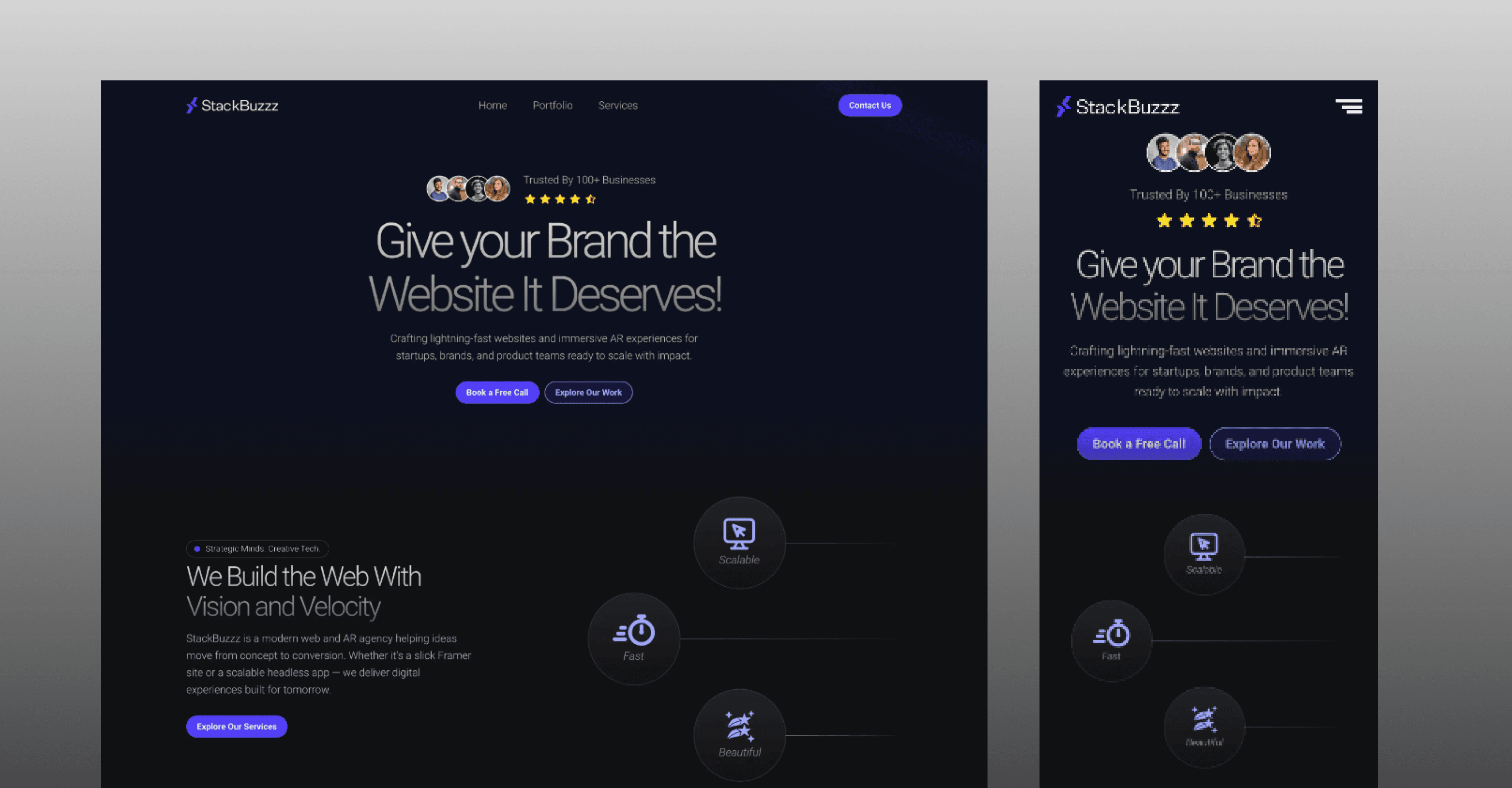
Stackbuzzz: Official Website
Client: Mr. Vedant (Founder, Stackbuzzz Pvt. Ltd.)
Industry: Information Technology
Project Type: Agency Portfolio Website
Role: UI/UX Designer & Framer Developer
Timeline: 2 weeks
Overview
Stackbuzzz is an IT agency that needed a professional, modern, and fully responsive website to represent its services and brand online. The goal was to create a dark-themed, visually engaging website that felt premium while remaining easy to navigate and intuitive for users.
I handled the project end-to-end, from initial exploration and design to final build and deployment.
1. Discover — Understanding the Problem
The Challenge
The existing online presence did not clearly reflect the agency’s capabilities or professionalism. The client needed a website that could:
Represent the brand with confidence
Feel modern and visually appealing
Work seamlessly across devices
Clearly communicate services without overwhelming users
Key focus areas
Clear structure and navigation
Strong first impression for new visitors
A dark theme that feels premium, not heavy
Balance between visuals and readability
2. Ideate — Exploring Concepts
Inspiration & direction
I explored a wide range of agency websites and modern SaaS layouts to understand how dark-themed designs are executed effectively without hurting usability.
What I worked on
Curated visual references and layouts for inspiration
Built a moodboard focused on:
Dark UI aesthetics
Strong contrast and hierarchy
Clean typography and spacing
Defined an overall direction that felt modern, confident, and structured
This phase helped set a clear visual and experiential foundation before moving into design.
3. Design — Bringing the Concept to Life
Design execution
Using Figma, I designed:
Custom graphics and visual elements
Using Framer, I designed:
A consistent dark-theme system that feels balanced and readable
Page layouts with clear content hierarchy
Build & deployment
Once the designs were finalized:
Ensured responsive behavior across screen sizes
Maintained consistency between design intent and final build
The design and build process stayed closely aligned, reducing friction and unnecessary handoffs.
4. Test & Refine — Usability & Iteration
Refinement process
Instead of formal usability testing, I focused on:
Reviewing navigation flow and page structure
Ensuring content was easy to scan and understand
Refining spacing, typography, and interactions for clarity
Iterations included
Improving visual balance in the dark theme
Adjusting layouts for better readability
Simplifying sections that felt visually heavy
The goal here was to make the experience feel smooth, intuitive, and distraction-free.
5. Delivery — Final Output
Final outcome
A fully responsive, modern agency website
Clean dark-themed UI with strong visual hierarchy
Easy-to-navigate structure suitable for first-time visitors
Successfully deployed using Framer
The website is now live and positioned to support the agency’s online presence and future growth.
Key Takeaways
Dark themes require careful balance between visuals and usability
Clear structure matters more than visual complexity
Designing and building together helps preserve design intent
Strong fundamentals create confident, professional experiences