YG Plywood
Client
YG Plywood
Services
Website Design, Landing Page
Timeline
4 Days
Year
2025
YG Plywood — Official Landing Page
Client: YG Plywood
Industry: Plywood
Project Type: Light-themed, Visually Rich Landing Page
Role: UI/UX Designer & Framer Developer
Location: Rajkot, Gujarat, India
Overview
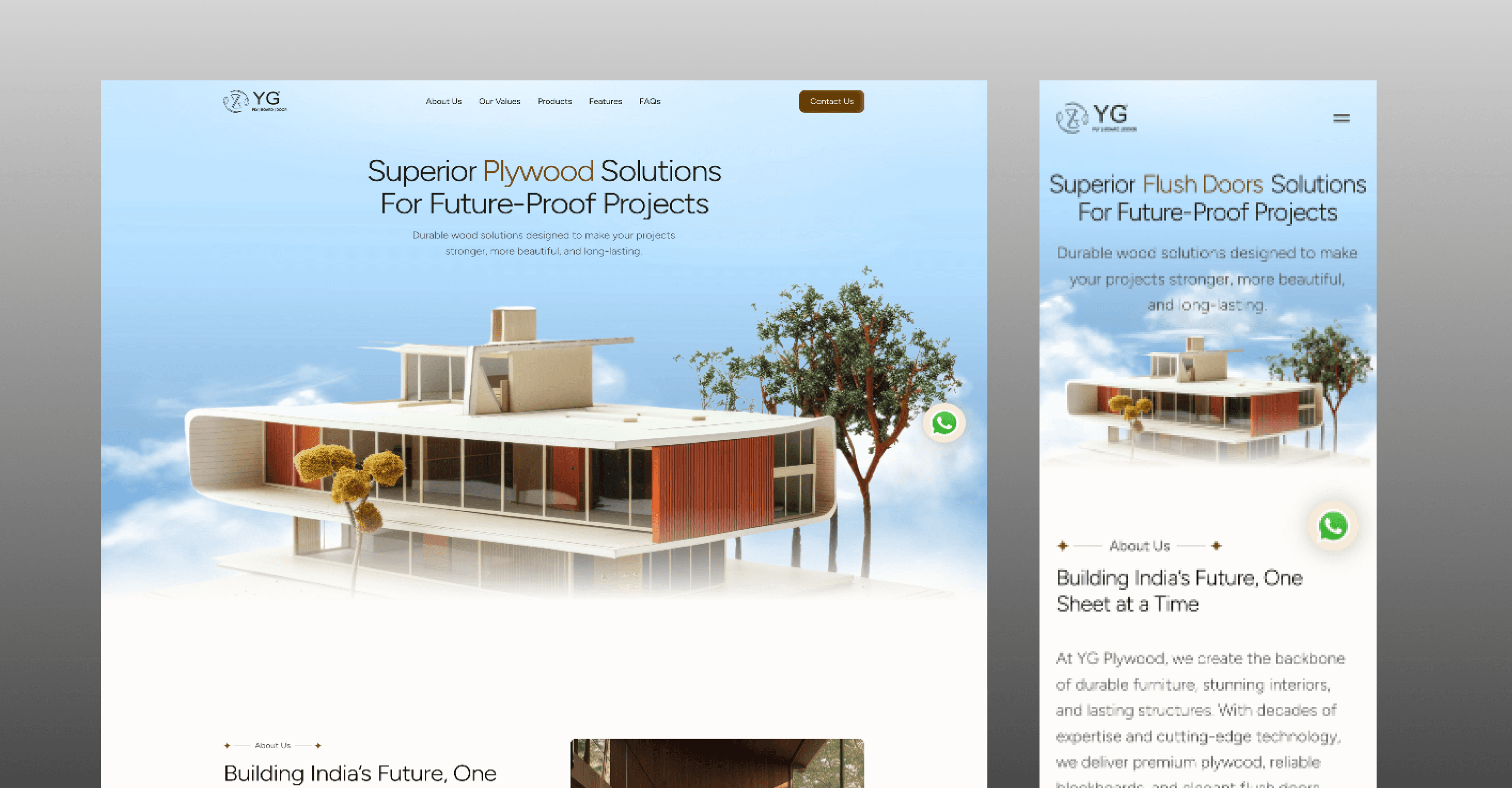
YG Plywood is a Rajkot-based plywood seller looking to strengthen their digital presence with a modern, visually engaging landing page. The goal was to move away from the typical, generic look seen across competitors’ websites and create a page that felt distinct, polished, and memorable, while remaining simple and easy to navigate.
I was responsible for the complete design and deployment of the landing page using Framer.
1. Discover — Understanding the Problem
The challenge
Most websites in the plywood industry tend to feel:
Visually dated
Structurally repetitive
Focused only on information, not presentation
The client needed a landing page that:
Looked professional and modern
Immediately stood out from competitors
Worked seamlessly across devices
Key considerations
Creating strong visual appeal without clutter
Maintaining clarity despite rich visuals
Keeping the experience lightweight and easy to navigate
2. Ideate — Exploring Concepts
Research & inspiration
I explored multiple websites within the plywood and materials industry and noticed a common pattern—most lacked strong visual identity and UI refinement.
Direction set
Based on this insight, I decided to:
Prioritize visual hierarchy and layout polish
Use clean typography and balanced spacing
Introduce subtle design elements that elevate the overall feel
The intent was to add a layer of UI charm that is often missing in this space, without overcomplicating the page.
3. Design — Bringing the Concept to Life
Design approach
Using Framer, I designed:
A clean, light-themed layout that feels open and modern
Visually engaging sections that highlight the brand effectively
Clear content flow to guide users naturally down the page
Special attention was given to:
Section spacing and rhythm
Visual balance between text and imagery
Consistent styling to create a cohesive experience
4. Test & Refine — Usability & Iteration
Refinement focus
Refinement was focused on:
Ensuring the landing page felt smooth and easy to scroll
Improving clarity and readability across sections
Fine-tuning visual elements so they enhanced, not distracted
Iterations included
Adjusting layouts for better responsiveness
Refining typography sizes and spacing
Simplifying elements that felt visually heavy
The goal was to keep the experience visually rich yet effortless.
5. Delivery — Final Output
Final result
A fully responsive, light-themed landing page
Strong visual presence that differentiates the brand
Clean structure with engaging design elements
The landing page is fully functional and has significantly improved YG Plywood’s brand perception and digital presence, helping the business present itself more confidently online.
Key Takeaways
Visual refinement can strongly differentiate even simple landing pages
Small UI details contribute heavily to perceived quality
Simplicity and visual richness can coexist when balanced well
Strong first impressions matter, especially for local businesses